Calling all font historians!

So, my brother’s decided to take up calligraphy / penmanship as a new hobby. Every morning he posts to Facebook in new fonts, inks, etc.. practicing his skills. Today he posted a “typewriter font,” which I thought interesting because I just imagined him manually adding in the little serifs on each letter. I went looking into the history of the word “serif” (and by extension its partner “sans serif”, literally “without serifs”) and discovered that it’s apparently as recent as 1813?
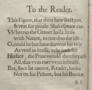
I quickly fired up my First Folio (because who doesn’t have that on hot key?) to look at the font used 190 years earlier (attached). Look at that! Serifs everywhere.
Of course this is simply a case that “they didn’t call them serifs back then,” I get that. What I’m wondering is, circa Shakespeare’s time, did the printing presses even have a concept of “choice of font”? When would serif versus sans serif have even entered the picture?
…I just had a horrible thought. Can you imagine if they’d printed the original First Folio in … <shudder> Arial?

The Tempest, the first play in the First Folio, was originally printed in Ariel.
kj
I would guess early printers had a very strong sense of fonts because they bought sets of type as sets, and probably kept a couple sets in house (black letter, a Roman, and italics for both), also larger sizes for titles and such. (If I wanted to be more sure, I’d go to the office to look at my Gaskell and/or McKerrow).