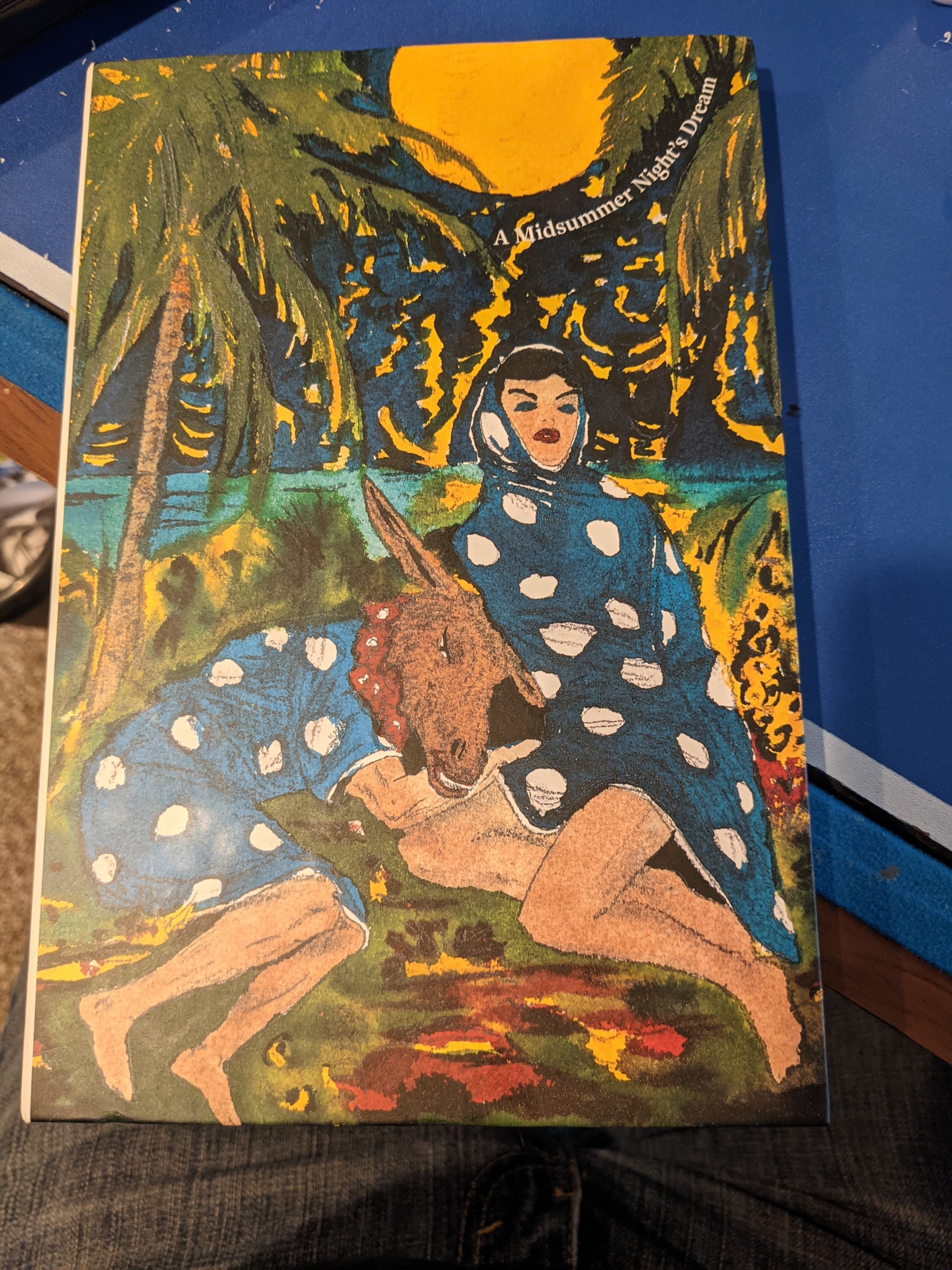
I realize that’s an awkward title, but there’s a lot of relevant information to impart and I wanted to hit the important bits. A Midsummer Night’s Dream is a very long play title. This is the second review of books I received from David Zwirner. For the first, Othello, see here.
A Midsummer Night’s Dream is an interesting play to me, the casual fan. Often thought of simply as “the one with the fairies”, the one that’s safe (and adorable!) to have five year olds perform, running around in their sparkly wings, reciting famous lines they don’t understand. But it’s got that darker side, too. It’s also the story of a husband whose wife is not sufficiently obedient, so he drugs her and takes what he wants. But then there’s also the overarching theme of dreams and reality and telling the difference between them, of putting on masks and presenting yourself to the world as someone or something that you’re not, voluntarily or not.
I guess what I’m trying to say is that there’s a whole lot of room when it comes to interpreting A Midsummer Night’s Dream.
Which brings me to our review. I gave the back story in the previous Othello blog post, but David Zwirner is an art gallery. These books are not new academic treatments of Shakespeare. The text, though well laid out and visually appealing, is the same text we’ve all seen before – line numbers, glossary terms, and so on. No extra commentary.
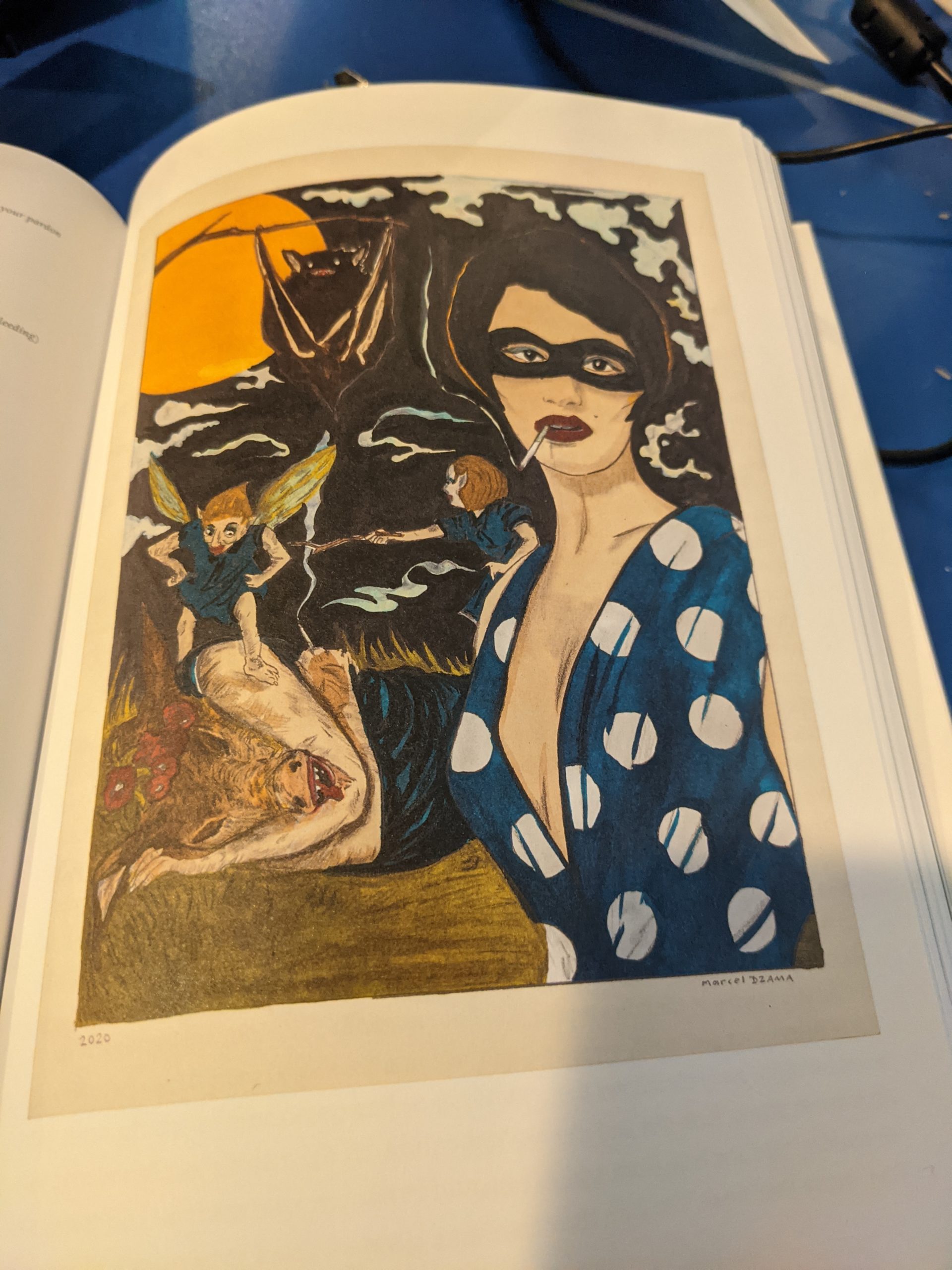
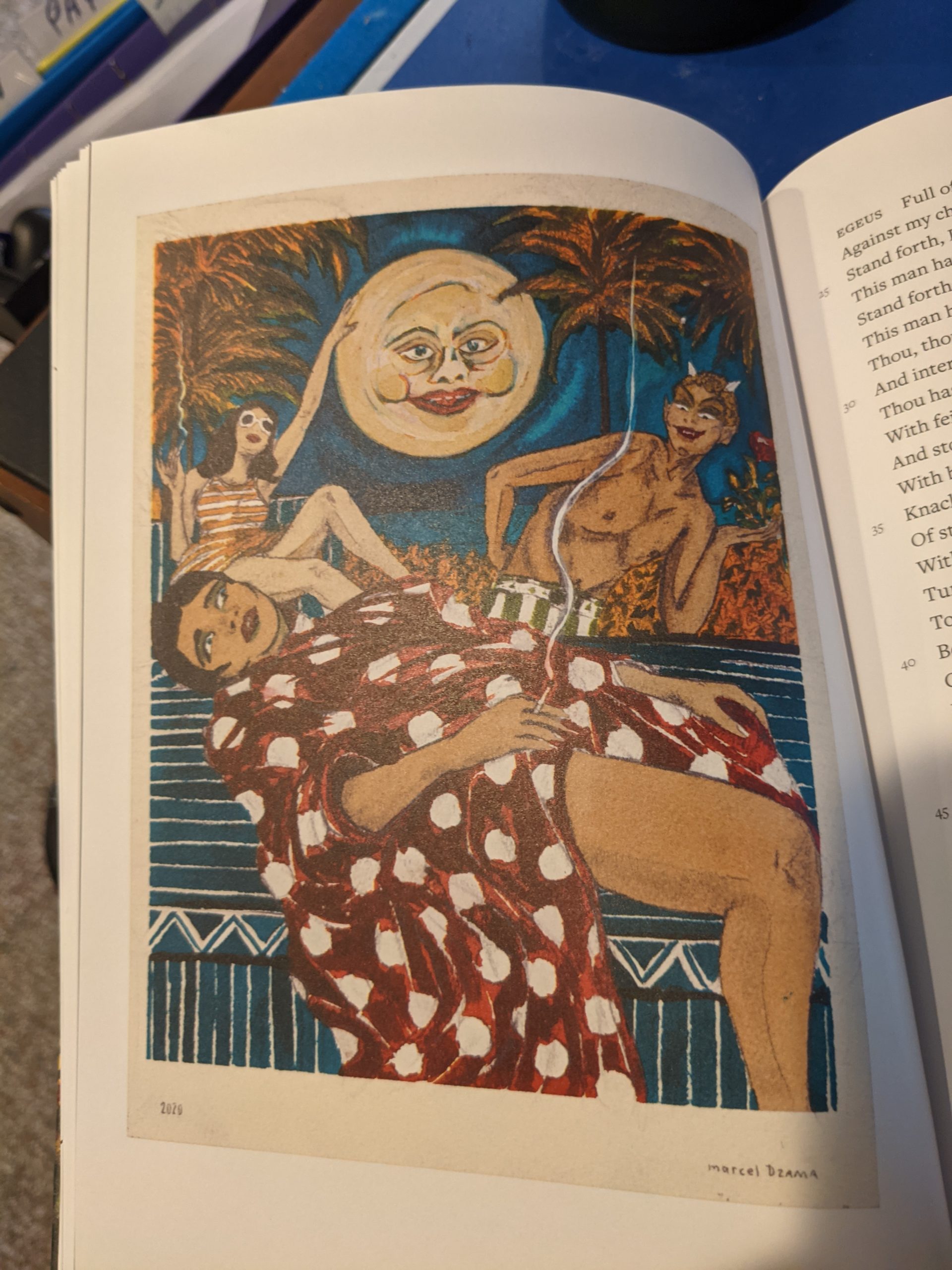
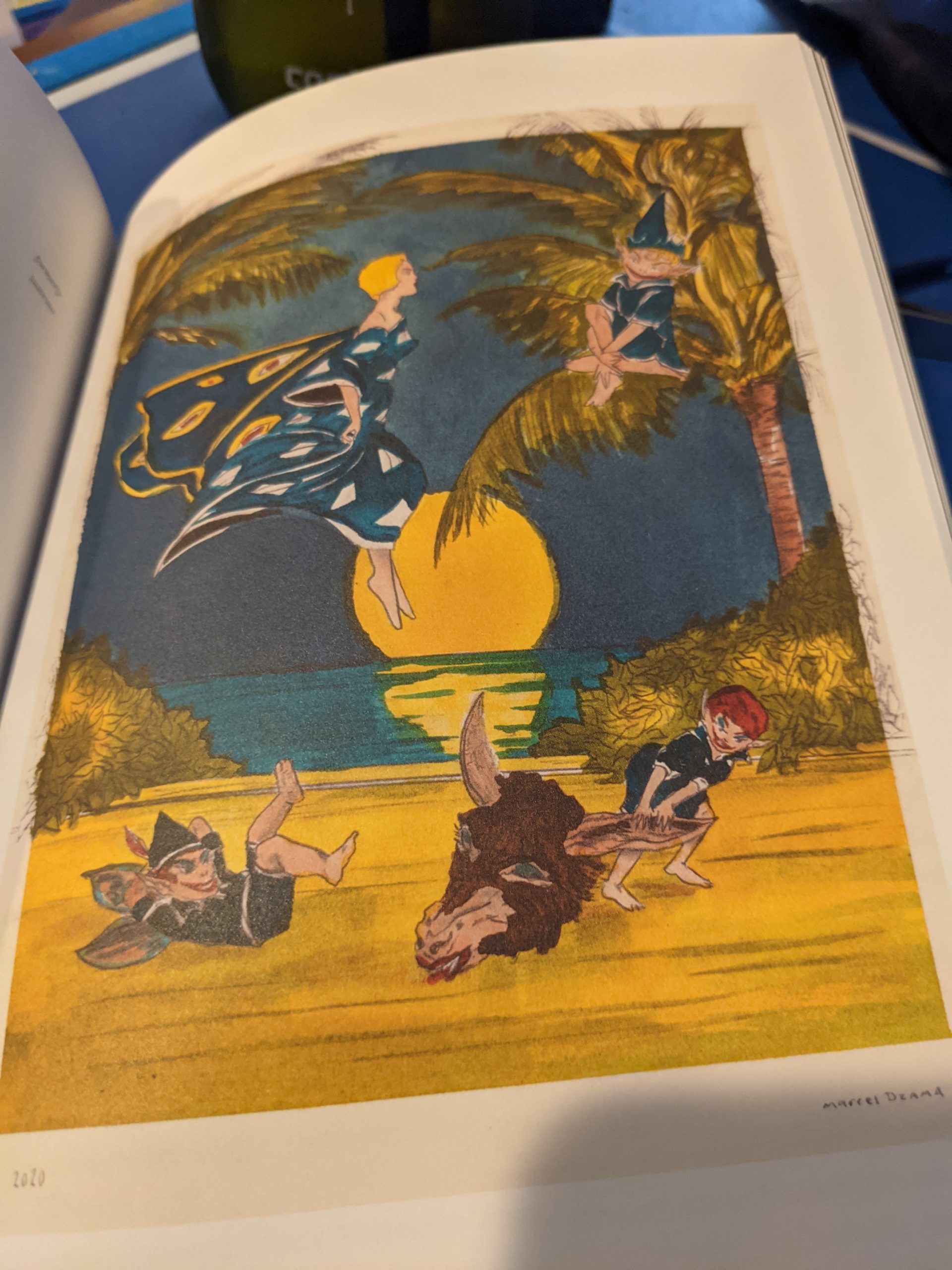
These books are about the art. It’s like walking through a museum, where Dream is the theme. You turn a corner and you see a painting, and next to it, the relevant scene from the play. (That’s not an entirely accurate analogy as this is the full text of the play, not just excerpts). And you admire the portrait and you examine the text and you discuss and interpret their connection. What is the artist trying to say here?


I feel a little bad, because I’m not completely sure how to usefully review a book like this where it’s all about the art. Art is something you want to see and experience for yourself. I run a blog specifically, and about Shakespeare specifically, because that universe is almost entirely about the words. I can copy and paste and type new words all day long. But I don’t have the experience or education in art to adequately describe this book. Hence, the best I can do is present my own opinion and maybe some badly framed images.

Wow! I LOVE illustrated books! There is a whole history of illustrated Shakespeare but unfortunately it is very hard to find good editions. And beautifully illustrated color editions–that’s rare indeed. You did a nice job, Duane, of picking some choice plates to reproduce and the colors come through brilliantly. The illustrations are lovely. Too often these days all you get are bare pencil sketches of a scene with no character at all. These really show imagination. That, to me, is the whole point of an illustrated edition–trying to bring the imagination of theater to the printed word. I’d like to see more of this kind.