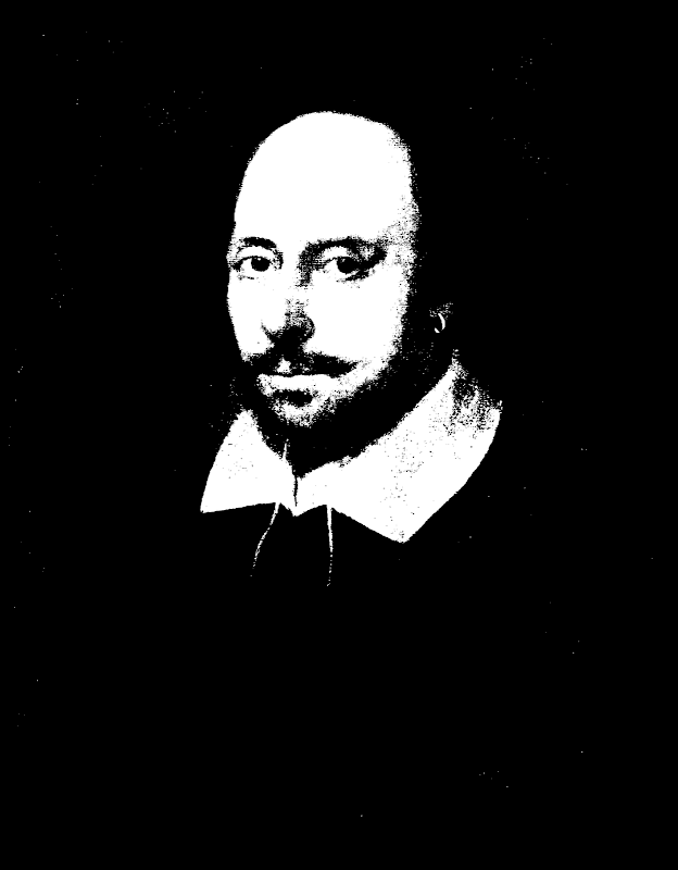
Every time I showed my wife the t-shirts I was making she’d say, “I don’t like big stuff on the front. Why not make just a little Shakespeare up in the corner, like an emblem? And then put something big on the back if you want.”
Worth a shot.
I’ve added three new shirts, all in the same basic style – a white-on-dark image taken from the Chandos portrait that I use as my logo. The image really only works in this scheme – I’ve tried dark-on-light but it doesn’t look good. Please note that “Customize” button – all of these are available in all men’s and women’s styles and colors (just dark ones).
The difference between the three is in the text:
- The image shown, with text ShakespeareGeek.com underneath. This particular sample is on a red shirt, but that can be changed.
- The same image (this time on a black shirt), with just “Shakespeare Geek”, no dotcom.
- Image (shown on a dark blue shirt), with no text at all.
So there you have it. Hopefully my wife is right and people do like this more understated “small on the front” style. Note that there is nothing at all on the back of these shirts. Enjoy!

