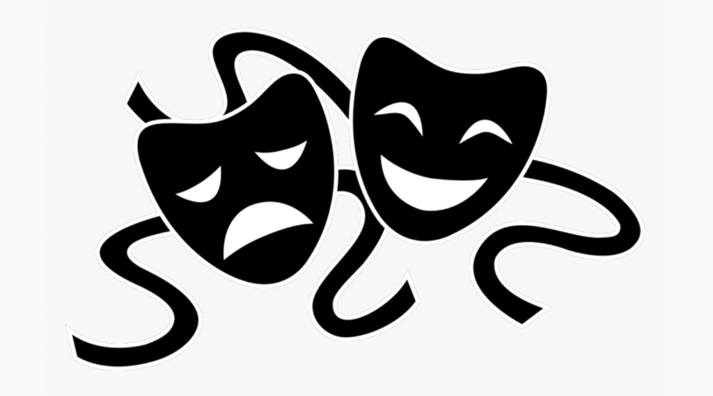
I had an idea for a new merchandise design – a very simple “All the World’s a Stage” font with a prominent display of the iconic tragedy/comedy theatre masks in some nice bright colors.
There’s about a zillion t-shirts out there that just show the quote, and maybe throw some clip art on it. I thought it would be fun to do something with actual original artwork. Something unique that someone else can’t easily rip off.
And, I thought, where better to get such artwork but an audience of Shakespeare geeks? I can’t draw. My visual skills are limited to taking other images and playing with them in photoshop until they get some interesting (eh) twist.
I’m wondering if there’s somebody out there who might be able to draw something like that for me? I’m putting it out there, it’s something I want to put on merchandise. I’m happy to send you a t-shirt (or coffee mug or tote bag or whatever you pick) as payment, if you like. And I’ll credit you accordingly, both in a specific blog post thank you as well as in the actual product description (to the extent I am able).
You know the image I’m talking about, right? Something like this…

But, you know, more interesting. The two should overlap a little. Definitely want the ribbon/string, it’ll give another element to color. The faces can have more personality, but should retain that minimalist, iconic representation so it’s more about the image as a whole and not about looking at the details of each individual mask. Personally I like big black outlines emphasizing the image, as if it could easily be represented as a pure line drawing – but that’s just my personal style, and like I said, I’m not the one drawing it. But it’s got to be something that really pops on merchandise and separates itself from background colors.
Any takers? I know I’m probably asking a lot but you never know unless you ask,maybe there’s some folks out there that love doing stuff exactly like this.
Thanks in advance! I look forward to seeing what you come up with! Maybe we can have a contest 🙂

I can play around with this. I’ve done my share of Tshirt designs. What kind of font did you have in mind? Do you want in to say Shakespeare geek somewhere on it? And specific colors?
Oh, cool! Honestly I was just thinking about the image itself, that way I could experiment with the best final look/quote/font/etc… I’ve commissioned a variety of complete t-shirt designs and I’m always left thinking that I wish I could tweak the details around the edges and change things up.
Definitely doesn’t have to say Shakespeare Geek anyplace, I think that’s a different kind of merch. If people are willing to pay for stuff I don’t think I should make it also do double duty as advertising (unless of course it’s literally a “Shakespeare Geek” shirt, which I also have!)
Thanks for your help!
Could be cool to have the words on the ribbon?
I think you’re right, but I wonder if it would be too subtle?
Not a visual artist, but I do newsletters, flyers etc thru manipulation. I like the idea of the quote on the ribbons. Unique. And you should have Shakespeare Geek on it somewhere.